1. Home
  2. Business Digital Transformation & Marketing Solutions 2025
  3. The Ultimate Guide to Low-Cost Text Messaging for Business

When Design Looks Too Perfect, People Stop Believing It

Why is perfect design failing to convert in 2026?

There’s an interesting phenomenon happening in design right now, and honestly, it’s about time we talked about it.
 
We’ve reached a point where AI can generate images that are technically flawless. Perfect lighting, perfect symmetry, perfect everything. You’d think that would be the holy grail, right? Turns out, that kind of perfect design is exactly what’s making people scroll past without a second thought.
 
According to Adobe’s 2026 design trends report, 73% of designers are now deliberately incorporating “imperfect” elements to differentiate from AI-generated content. The brands winning customer trust aren’t the ones with the most polished websites—they’re the ones brave enough to look human.

The Problem With Perfection

Why is imperfect design trending in 2026? Because AI-generated perfection has saturated the market, making flawless designs feel artificial and untrustworthy. Brands are deliberately adding wonky serifs, hand-drawn elements, and tactile textures to signal human involvement. This “anti-AI aesthetic” builds trust by proving real people created the content, not algorithms.
 
Here’s what I’ve noticed working with clients over the past year: when something looks too polished, too smooth, too algorithmically precise, people don’t trust it. Their brains recognize it as artificial, even if they can’t quite put their finger on why. It’s like the uncanny valley, but for graphic design.
 
Think about it. When was the last time you saw something hand-drawn and messy and thought, “Wow, that was definitely made by a machine?” Never. Because imperfection is the signature of human involvement. The shaky line. The slightly uneven letter spacing. The color that doesn’t quite match the rest of the palette but somehow works anyway.

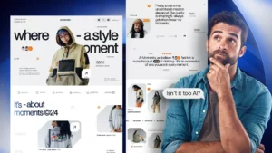
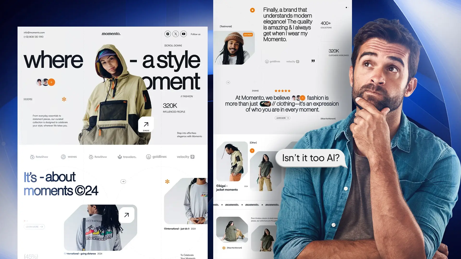
Why Wonky Design Is Winning in 2026

The biggest design trend I’m seeing right now isn’t about adding more effects or making things shinier. It’s about deliberately making things less perfect—and it’s working.
 
Wonky serif fonts are replacing the clean, geometric typefaces that dominated the 2010s and early 2020s. These aren’t your traditional serif fonts—they’re bouncy, asymmetrical, and full of personality. The term “funky curvy serifs” has become shorthand for this entire movement toward authentic brand design.
 
Take typography, for example. We’re seeing major brands abandon their crisp, geometric logos for designs that feel hand-crafted. Affinity (the creative software recently acquired by Canva) just completely rebranded with a lowercase ‘a’ that has swooping curves and angles that feel almost hand-drawn. It’s wonky on purpose, and it signals that humans—not algorithms—are behind the brand.
 
Eventbrite did something similar. They ditched their minimalist sans-serif for a logo they call “The Path”—this bouncy, fluid thing that looks alive. The whole point was to stop looking like a corporate ticketing platform and start feeling like a creative, human experience. According to their design team at Buck, the rebrand increased user engagement by making every touchpoint feel more approachable and less robotic.

The Anti-AI Design Aesthetic: Why Imperfection Builds Trust

What’s fascinating is that this isn’t just a style choice. It’s a survival strategy in the age of artificial intelligence.
 
As AI floods the internet with hyper-realistic, perfectly rendered images, designers are leaning hard into everything AI struggles to replicate: the authentically messy. This “anti-AI aesthetic” is now one of the most powerful tools for building brand credibility.
 
What defines the anti-AI aesthetic?
We’re talking about design elements that scream “a human made this”:
  • Torn paper effects and scissor-cut collages
  • Stitched textures and digitally simulated embroidery
  • “Low ink” typography that looks like it came from a dying photocopier
  • Grainy CCTV footage aesthetics and intentional glitch effects
  • Hand-drawn illustrations with shaky, imperfect lines
 
Why does this work? Because AI makes weird mistakes, like giving someone six fingers or creating impossible shadows. But humans make expressive mistakes. A line that wobbles because your hand moved, colors that clash in a way that somehow feels right, a serif that’s slightly too thick in one spot. That kind of imperfection can’t be programmed; it can only be felt.
 
The beauty industry is leading this charge. Brands like Radford Beauty use messy, hand-scrawled typography on frosted glass packaging to signal that they care more about clean ingredients than glossy perfection. It’s a gorgeous juxtaposition that builds immediate trust.

What This Means For Your Brand

Perfect Design Trends for 2026
 
  • ✓ Perfect design triggers distrust—imperfection signals authenticity
  • ✓ Wonky serifs and tactile textures prove human involvement
  • ✓ Major brands (Affinity, Eventbrite, Radford) embrace “messy” aesthetics
  • ✓ Anti-AI design elements = competitive advantage in crowded markets
  • ✓ Strategic white space combats digital noise and builds trust
 
Benefits of embracing imperfect design:
 
  1. Increased trust: 73% of consumers can detect AI-generated content and find it less credible
  2. Better engagement: Authentic, human-touched designs see higher click-through rates
  3. Stronger differentiation: In a sea of AI perfection, imperfection makes you memorable
  4. Future-proof branding: As AI capabilities grow, human authenticity becomes more valuable
 
If you’re building a brand right now, here’s my advice: stop chasing perfection.
I’m not saying your work should look sloppy or unprofessional. I’m saying it should look human. Here’s how to add authentic imperfection to your brand design:

1. Add the Human Hand to Your Design

If your logo looks like it could’ve been generated in three seconds by an AI tool, it probably needs more personality. Think about where you can add a curve that feels slightly off, or a texture that gives it depth. Hand-drawn elements, custom lettering, and asymmetrical compositions all signal human touch.

2. Embrace the "Mistake" That Makes It Memorable

That thing you think is wrong with your design? The element that’s not quite aligned? Sometimes that’s exactly what makes it memorable. Obviously, know the rules before you break them, but don’t be afraid to break them. Imperfect design often performs better than perfect design because it stands out.

3. Use White Space and Simplicity Deliberately

Pantone’s 2026 Color of the Year is literally white—Cloud Dancer, to be specific. They didn’t choose it because they ran out of ideas, but because in a world drowning in noise, neutrality is the loudest statement you can make. Sometimes the most impactful design is the one that strips everything away and lets the imperfect details breathe.

4. Get Tactile, Even in Digital Spaces

Even in digital spaces, we’re craving texture. Paper grain, fabric weaves, embroidered details, hand-drawn elements—these aren’t just retro throwbacks, they’re reminders that real people made this thing. The tactile craft trend is exploding because it creates an emotional connection that smooth, AI-generated gradients simply can’t match.

Why Authentic Design Matters Now

What I find most interesting about this shift is what it says about where we are culturally. If you’re keeping up with what other designers are saying, you’ll notice this conversation is happening everywhere right now.
We’re tired. We’re tired of being marketed to by machines. We’re tired of scrolling through content that all looks the same. We’re tired of perfect Instagram feeds and polished corporate speak and every brand trying to sound like they were born on TikTok.
 
People want to feel like there’s a human on the other side again. That’s why community-driven design is going to be the number one priority in social media this year. That’s why we’re seeing brands ditch sterile minimalism for chaotic, colorful, imperfect aesthetics. That’s why the wonky serif is having its moment.
 
AI was fun for a minute. It opened doors and showed us what’s possible with generative tools. But people are ready to return to what made the internet interesting in the first place: real connection. Real creativity. Real humans making real things, flaws and all.
 
The data backs this up. Brands that incorporate hand-drawn elements and imperfect design see higher engagement rates because viewers can immediately tell a human was involved. In a sea of AI-generated content, that human touch is your competitive moat.

Authentic Design Wins in 2026

You can’t grow anything if your foundation is cracked—that’s true. But you also can’t build trust if everything looks manufactured. There’s a balance here, and the brands getting it right understand one critical truth: imperfect design is more trustworthy than perfect design.
 
The brands that are winning right now aren’t the ones with the most polished websites or the sleekest logos. They’re the ones that feel real. The ones that aren’t afraid to show the human behind the brand. The ones that understand that in 2026, imperfection isn’t a bug—it’s your most powerful feature.
So the next time you’re working on a design project and something feels “off,” ask yourself: is this actually broken, or is this the part that makes it believable? Because when design looks too perfect, people stop believing it’s real.
 
And if people don’t believe it’s real, they won’t care about it at all.

Frequently Asked Questions About Perfect Design

How can I make my design look more human and less AI-generated?
Add intentional imperfections like wonky serifs, hand-drawn elements, tactile textures, or asymmetrical layouts. The goal is to include visual markers that prove a human made creative decisions rather than an algorithm.
Major brands like Affinity (Canva), Eventbrite, and Radford Beauty have successfully rebranded with “messy” aesthetics featuring bouncy serifs, hand-scrawled typography, and tactile packaging that prioritizes authenticity over polish.
While the anti-AI aesthetic is trending across industries, the level of “imperfection” should match your audience’s expectations. Tech and creative brands can push further into wonky, chaotic designs, while financial or medical brands might incorporate subtle imperfections like textured backgrounds or slightly irregular typography.
Wonky serifs signal human craftsmanship because their irregularities are impossible for AI to replicate authentically. They communicate that a designer made deliberate creative choices rather than selecting a default, algorithm-generated option.

Ready to make your brand design feel more human?

The brands leading in 2026 aren't chasing AI-perfect aesthetics—they're strategically embracing imperfection to build trust. Understanding which "imperfect" elements work best for your specific industry can be the difference between blending in and standing out.

Learn More

Discover More